SnackPass

Project Specs
Position: UI | Visual Designer
Client: SnackPass
Time limit: 2.5 weeks
Platform: Mobile platform
Tools: Sketch, Google slides, Invision
The Challenge
SnackPass is a new mobile snacking app that is subscription based created by a company called Zero percent, which their mission is to reduce leftover meals by delivering them to charities. They explored the concept of selling snacks from participating restaurants at a discounted rate as a solution.
To cover the cost of this mission, they are using SnackPass as a social empowerment movement having users being part of this by paying it forward and seeing where their money is spent. The company's target audience is the young urban professionals that live/work/ contribute their time downtown Chicago.
Product Requirements
Using prior UX wireframes, the goals for requirements were based on several keywords:
Curation, which they noted that the subscription would be changing to monthly, so they want to make sure the organization was necessary for the user to use. Example of this would be "Hotel tonight" app.
Seamlessness: simple and straightforward for the user to use without confusing them. Example of this would be either Groupon and Starbucks, especially regarding redemption.
Social aspects: the “feel-good” feeling needed to be shown somehow to show the social good of the app. The attitude of inclusive, community-driven needs to be evident.
Aesthetic standpoint: current colors are blue and orange which felt optimistic and trusting.
Research
Using current market research, we learned people do not connect to package deals but with something that has a driver which for example Tom's Shoes which the idea of "buy one, donate one" for the price of one. For this case the strategy to have the user to have an impact by giving them the opportunity to buy one and then donate.
Concerning the client’s wishes, we set out as a team to research competitive visual analysis comparing how other competitors were using their visuals. Using companies like Classpass, Starbucks, Netflix, and WeWork we found the key signifiers that we wanted to focus on that made the competitors successful. For instance, use of Card boxes and photos were a repetitive foundation among many. The clean and orderly feel were also important as well client wishes that should be translated into the actual design process. These terms led me into the exploratory mood board to get a visual inspiration that would get client’s attention.
Design System
To rise to the challenge, using three perspectives with two safe styles and one bold angle, I wanted something that elevated the client as well the potential user by using two safe boards and one impact driven to compare the differentiation of each style.
MoodBoards

Uusing certain colors would make the app more approachable yet allowed the users to be optimistic about the snacks they were purchasing by contributing the community even in a small, impactful way yet feeling energized to continue making the impact.
When the client mentioned “collective community and impact is more important,” I addressed this by using soothing colors with photography expanding the palette by telling the story to the users. With limited space, photography would address the spacial issue.

Out of the ordinary, lively and inclusive color palettes different type of card that draws the people into the app.
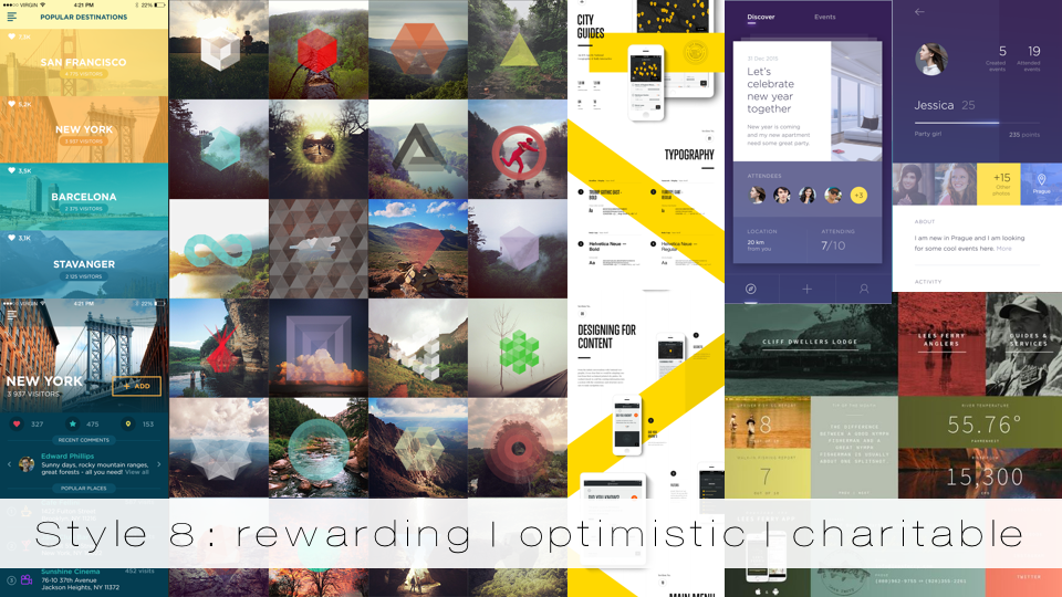
Style Tiles


Our Approach
The interface goal I wanted was to be functional & straightforward by giving the users the opportunity to go straight to their objectives of finding their snacks that are located nearby. As well modest information that speaks of numbers of meals that they rescued by donating them to charities during their duration of membership; additionally they can check the in-depth version of their impact. Using timeline in an interactive visual matter, the users can see their contributions to date.