Education Intranet

Education Redesign
Product design
Position: Designer
Project Timeline: Stage one: 10 months | Stage two: 6 months
Platform: Desktop and Mobile
Tools: Adobe Illustrator and Photoshop
Problem Statement
The educational institution had been hemorrhaging money yearly for new and existing school teacher alike by printing a yearly handbook on new policies, onboarding information, and educational guidelines. However, the data would be out of date within three months into the school year. Deciding to save the cost of printing and making everything digital for the teachers and staff alike, they turned to Google for assistance and got Google’s content management system that allowed frequent updates.
Product Requirements
Tablet and desktop friendly for teachers
Simple search Navigation
Better and simple visibility are allowing a cleaner and modern look.
Organized hierarchy and flow.
Improved accessibility, using minimal Call to action buttons and icons.
HTML friendly, no CSS build in as limited as possible.
The Approach

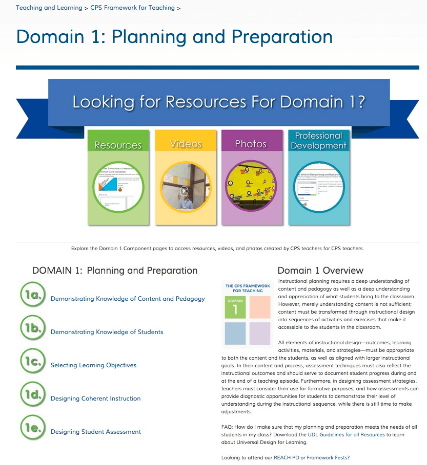
My role broken into two sections, first lasted about ten months of creating an online presence for teachers to start learning how to use the “knowledge center.” The second portion was to take everything and make it responsive and mobile friendly. We interviewed different staff such as teachers, office workers, and leadership. We did also learn that even though the school district is up to date in technology, not many teachers were so we had to make that very simple to use hierarchy. Note that there were almost 100 pages that had to be redesign within the scope of the project. We also redesigned the institution’s branding within the intranet and make it a more mobile-friendly second time around because not all teachers had a laptop in the classroom and many used tablets to teach.
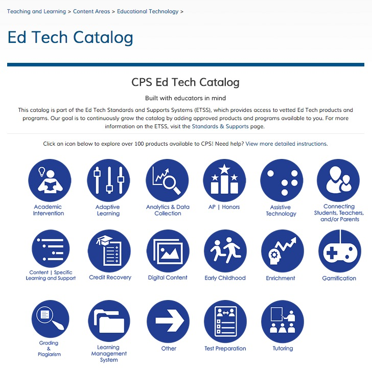
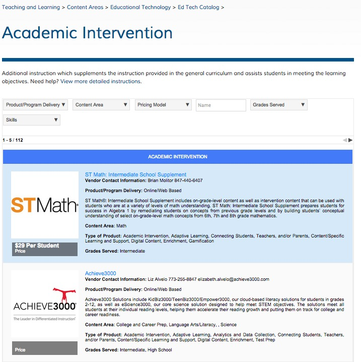
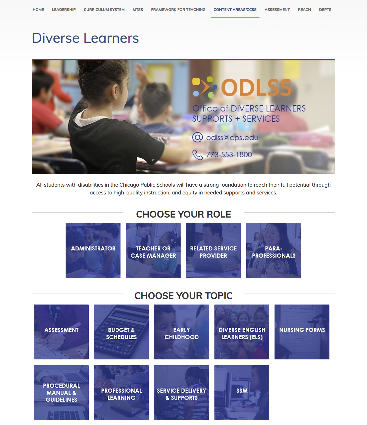
We found that there was a disconnect from teachers to the institute’s leadership, so we decided that it was a place to bridge that gap. By doing that we introduced several pages that shared the same resources such as the weekly newsletter and the announcement pages. We also have subsections for teachers who were new and needed a better onboarding experience (however due to the confidentiality and nature of the project, it cannot be shown in public). Each department within the institution that focused on specific studies such as history, math or English as the second language had its pages that allowed other departments to learn from. There would be resources included as well common core standards expectations listed within their department.
Final Thoughts
The process was interesting to learn as we had a different type of users and had to satisfy our stakeholders of almost 400,000 staff within the district. Each department had their vision that we had to work with but also inform them some of their wishlists was unattainable due to constrictions of the content management system that was given to the institution for free by Google. We could not use the html3/css3 as they were not recognizable to the CMS, so limitations for buttons were evident in the process. The goal is to upgrade in the future to make even more accessible as well including parents in a subpage linking to updating them on their children process.
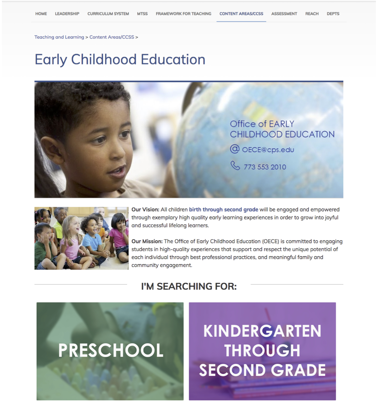
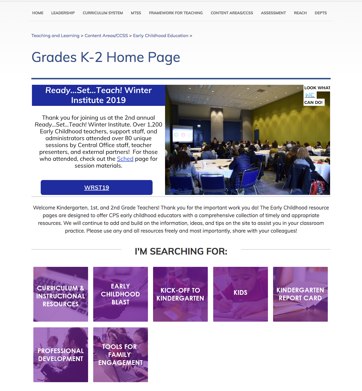
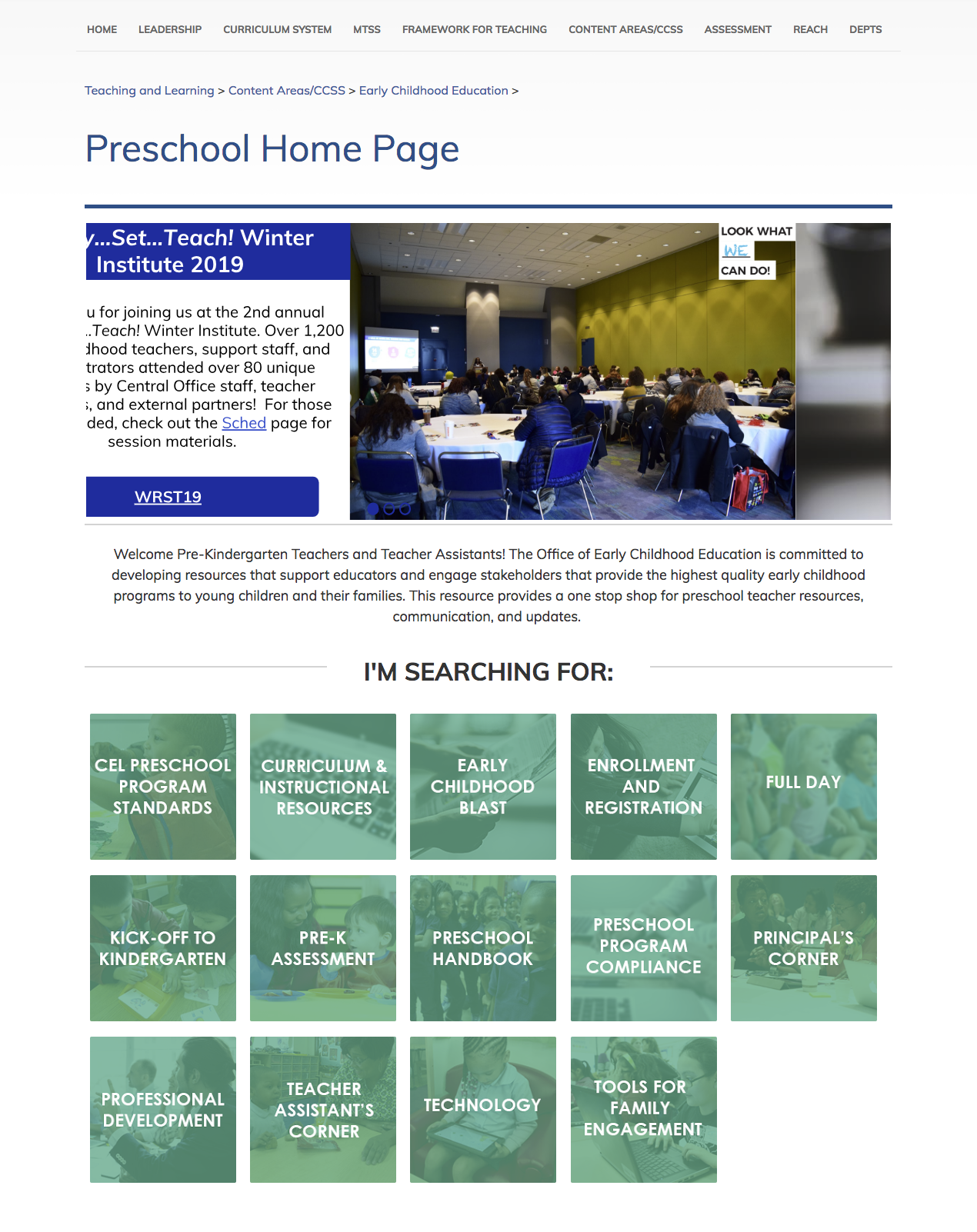
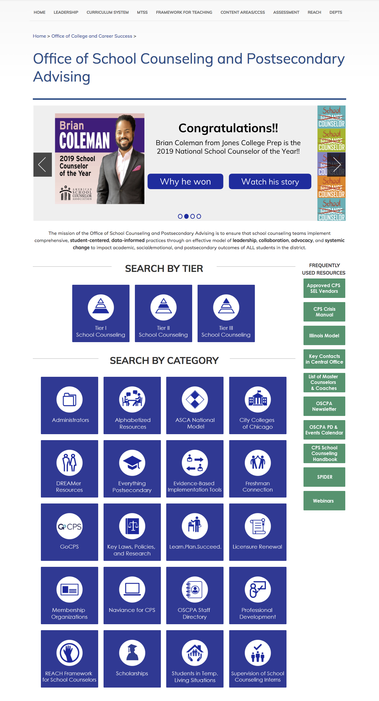
Below are examples of final web pages that were created. Note that some of these pages have been updated since my departure.